Intro to CSS Variables
What is a CSS Custom Property?
Per MDN:
Property names that are prefixed with
--, like--example-name, represent custom properties that contain a value that can be used in other declarations using the[var()](https://developer.mozilla.org/en-US/docs/Web/CSS/var())function.
So it's basically a variable that we can use in native CSS now, and in order to use the variable to set a css property like font-family for instance, you use the var() function. The idea of the variable exists in most (if not all) of programming languages. The unique property of CSS Custom Properties is that they are subject to the cascade and inherit their value from their parent, just like CSS selectors. And unlike variables in other languages, they must be assigned to a selector.
Declaring a custom property
Custom properties begin with 2 double dashes '—', followed by the name of your property. The value can be any valid CSS value.
The custom property's scope is defined by its selector. There is technically no "global scope" in CSS so it is common to add custom properties to the ::root pseudo-class when it is needed globally. It is also perfectly safe to assign your global values to the body element.
Global
:root {
  --font-family: sans-serif;
}
Local
p {
  --my-custom-property: value;
}
The var() function
When you want to use a custom property you use the var() . The var() function actually takes 2 arguments, the first is the property name itself and in the second argument you can specify an optional fallback value if property name is either invalid or undefined.
p {
	font-family: var(--sans-serif, sans-serif);
}
Fallback values
So a few more things to be aware of for fallback values.
In this code-block we have a few examples of fallbacks being used. And you'll notice that for the paragraph tag we're actually using a custom property as the fallback.
main {
  background-color: var(--main-bg-color, #ccc);
}

p {
  font-size: var(--paragraph-font-size, var(--global-font-size));
}

footer p {
  font-size: var(
		--footer-paragraph-font-size,
		var(--font-size-small, var(--global-font-size))
	);
}
And to get even crazier the last ruleset for the footer p the fallback values have their own fallback values! There is technically no limit to the number of times you can nest fallbacks. But be careful, because this can cause performance issues because it takes more time for the browser to parse each value.
How var() handles commas
Another interesting feature of the var() function is that everything between the first comma after the property name and the end of the function is considered the fallback value. So if you were to use a comma delimited value as you can for setting the font-family property, that would be totally valid.
p {
	font-family: var(--font-family, system-ui, sans-serif);
}
The example below demonstrates this behavior by using a comma separated list of fonts as the fallback for the h1's font-family property. In the rule for the h1 I am using a --font-family custom property and using a font list as the fallback. And I am setting the first font in the list to an invalid font-name to ensure that it loads the next font, in my case I have Impact loaded on my machine so that's what I see.
Inheritance
Per MDN:
Custom properties are subject to the cascade and inherit their value from their parent.
So custom properties behave just like css properties when it comes to inheritance. You can create globally available values by setting it at the top of the cascade and you can override those values where it's needed.
body {
  --text-color: #000000;
}

p {
  color: var(--text-color); /* #000000 */
}
body {
--text-color: #000000;
}
p {
--text-color: #2f2f2f;
color: var(--text-color); /* #2f2f2f */
}Overriding Defaults
So lets say you have a component like a button, and you want the ability to easily override the default background color of the button. There are 2 approaches you could take with different implications.
In the the example below there are 2 button components. The button in Approach A explicitly sets the --btn-bg-color custom prop to a global custom prop called var(--primary-color) and then uses that property to set the value for the background color.
//APPROACH A
.btn {
  --btn-bg-color: var(--primary-color);
  background-color: var(--btn-bg-color);
}

//APPROACH B
.btn {
  background-color: var(--btn-bg-color, var(--primary-color));
}
The button in Approach B component does not explicitly set the --btn-bg-color prop. Instead we use the fallback argument in the var() function to set the default to var(--primary-color) .
So what is the point of this exactly? Well they will both achieve their purpose of setting the background color to var(--primary-color) but with one key difference. In the example below there are 2 rows of buttons of different colors wrapped in a p tag. Both p tags have in inline style assigning the color --purple to the --btn-bg-color prop. However only the button row using the fallback approach has its color set to purple. Because the buttons using the fallback approach do not have the --btn-bg-color set, it inherits the color from its nearest ancestor.
This isn't to say that you should use one approach over the other. The purpose is just to demonstrate the role that inheritance plays when using custom properties.
Valid Values
From MDN:
The classical CSS concept of validity, tied to each property, is not very useful in regard to custom properties. When the values of the custom properties are parsed, the browser doesn't know where they will be used, so must, therefore, consider nearly all values as valid.
So that means you can assign any value you want to a CSS custom property and it's validity will be determined by whether you are using the variable in a way that the browser can understand.
How the browser handles invalid values
Below you can see there are two h2's with different classes. The first has the font size set to green and the second has the font-size set to a custom prop of --var with a value of green.
And you can see they are actually treated differently by the browser. If you look in devtools you can see that the browser knows that the font-size for the first h2 is invalid.
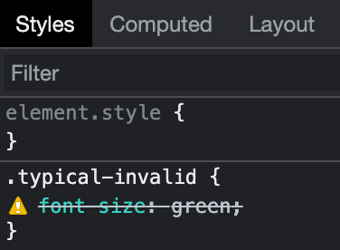
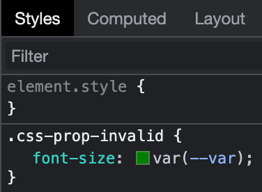
However for the second h2 being set by the custom prop, the browser still considers the value valid. So it shows that we kind of lose the ability to debug our css a little when using custom props.
The Toggle Trick
This actually leads to an interesting and (maybe) unanticipated side effect. Because any value is considered valid, even white space can be used. With this you can create a kind of if/else statement to toggle a bunch of values at one time.
In the example below I've created a css variable called --reduce-motion-toggle with a value of initial. I am using that variable as the animation name with the fallback value being the rotate animation that I've defined. So when the browser encounters the invalid value of the variable, it falls back to the valid value. I've then created a media query to detect when the user prefers reduced motion and assign it a value of " " (ie whitespace!). So when users have that preference, the animation will no longer work, because of course " " (whitespace) is not the name of an actual animation, but it is accepted by the browser as a valid value!
Now do I think we should all start using this in our production CSS? Maybe not. It's not clear at first glance what's going on if you're not aware of this side effect, so it could create more confusion in the long run. But I do think it points to how new features can be used in ways that go beyond what the spec authors originally intended, and it shows how there is a desire for something like a boolean type variables in CSS.
Custom props and calc()
The calc() function gives us the ability to perform mathematical calculations in our css. You can use arithmetic operators for addition, subtraction, multiplication and division and the browser will return the result at runtime. You can even use different unit types.
Without calc()
.width-one-third {
	width: 33.33333%;
}
Let the browser do the math!
.width-one-third {
   width: calc(100% / 3);
}
Combining Units
.inset-container {
  width: calc(100% - 30px);
}
And when you combine calc() with custom props, you now have a powerful way to create dynamic layouts.
Modular Scale
One thing I like to do with all my projects is to create what is called a modular scale for font-sizes and spacing. Basically a modular scale is a set of numbers that increase and decrease in value by a set ratio. The Golden Mean is a ratio that has been used by architects and artists for centuries to create visual harmony in their work. And you can actually incorporate a modular scale quite easily by combining css custom props and the calc function.
Creating a modular scale
So let's see how we would set up a modular scale using custom props.
In this example we have 2 custom properties. The first is our scale ratio. Type-Scale.com is a great resource for generating typographic scales. The second property is our base size, 1rem (the s prefix stands for 'scale'). This will be the foundation for our modular scale.
In this second example we use the --scale and base size --s0 custom props to build out our modular scale. To get our next size up --s1 we use the calc function to multiply --s0 by the --ratio prop. For each new size you multiply the previous size prop by the ratio property. And conversely to achieve values smaller than the base size you divide by the scale property. And this is all made possible by the ability of calc() to perform mathematical operations on css length units like rem (or px, ems, etc).
The basis of our scale
:root {
  --ratio: 1.618
  --s0: 1rem;
}
Adding more sizes
:root {
  --ratio: 1.618; /* Golden Mean */
  --s-1: calc(var(--s0) / var(--ratio)); /*  calc(1rem / 1.5) = 0.66rem */
  --s0: 1rem;
  --s1: calc(var(--s0) * var(--ratio)); /*   calc(1rem * 1.5) = 1.5rem */
  --s2: calc(var(--s1) * var(--ratio)); /*   calc(1.5rem * 1.5) = 2.25rem */
}
/* credit: https://every-layout.dev/rudiments/modular-scale/ */Drawbacks and gotchas
So like every (relatively) feature there are going to be some advantages and disadvantages.
No Media Query support
Custom properties cannot be used in media queries. This is due to the fact that media queries are not actually connected to the DOM. So when a custom property is attached to the body element, the media query will be unaware of it.
body {
  --mobile-breakpoint: 480px;
}

.btn {
  display: none;
}

/* WON'T WORK! */
@media screen and (min-width: var(--mobile-breakpoint)) {
	.btn {
    display: block;
  }
}
In the future we may be able to create custom media queries using environmental variables. There is currently a spec for using environment variables for media queries.
@custom-media --narrow-window (max-width: 30em);

@media (--narrow-window) {
  /* narrow window styles */
}
Not supported in any version of Internet Explorer
If you need to support versions of Internet Explorer, you'll be stuck using a polyfill. The custom property polyfill developed by the PostCSS team is one of the more popular ones.
Limited in their functionality compared to Sass
The ability to create a custom sass function or mixin and then assign them to a sass variable is one of the big reasons I still love to use sass. CSS has introduced some powerful functions like calc() , min() , max() , and clamp() that allows us to make our custom properties responsive. But it will definitely be a while before I feel comfortable ditching Sass and writing in native CSS only.
/* Sass */
@function screen-width($width) {
  @if map-has-key($breakpoints, $width) {
    @return map-get($breakpoints, $width);
  } @else {
    @return null;
  }
}

$breakpoint-mobile: screen-width(40);
Practical Use Cases
So those are the basics of CSS custom properties, but what are they useful for exactly?
What was previously only available in a preprocessor like sass or less, or post processors like PostCSS are now available in native CSS. That's a huge step in the evolution of the language. Here are some other practical that uses that I've found for custom props.
Keeping your code DRY
You can use css custom variables to save yourself from having to repeat values like hex color codes. Instead, you can use a more human readable and memorable value. And like any other variable, you can change its value once and make sweeping changes in every place it's used.
//css custom property
:root {
  --primary-color: #b002a1;
}

.btn {
	background-color: var(--primary-color);
}

h1 {
  color: var(--primary-color);
}
The difference with css custom props is that since they are defined in the css, they can be viewed and changed in the browser. When you open your dev tools in your browser of choice, all the properties you have defined on the page will be exposed in your styles, which is a nice convenience when you need to quickly reference them.
You can update values inline
CSS custom properties are evaluated at run-time by the browser, which means you can update your properties right in the markup. This is a huge advantage over Sass.
In the example below I've created a simple card component. I'm using a custom property called --card-color to set the color of the border, heading and button. The first card doesn't have the color property set so it uses the fallback color.
In the markup for the second card I set the card color via the style attribute. And with just that one inline style I'm able to update the color in 3 places!
Great for creating dark themes
Dark mode themes have become increasingly popular, and custom props makes implementing them much easier.
In the example below I've created some color props to set up the dark mode theme. The generic --bg-color and --txt-color properties are assigned to the body element. I then added some light and dark themed color props and set up the generic props to use the light theme by default.
Then we can use a media query to check if the user has dark mode set via their operating system settings. The benefit of this approach is that we are able to make global changes to our styles with very little code.
And that's a very high level overview of CSS Custom Properties. I feel like they are slowly being adopted and introduced into production code more and more, so I think as developers start to use them more we'll start to see them used in creative ways beyond what I've described here.
Credits / References
- MDN
- CSS properties with defaults
- A Strategy Guide to CSS Custom Properties
- The CSS Custom Property Toggle Trick
- Modular Scale
- type-scale.com
- Setting CSS Custom Properties with JavaScript
- CSS Custom Properties in the Cascade
- CSS Custom Properties and Media Queries
- PostCSS Custom Properties polyfill
- Custom Media Queries specification
- caniuse.com